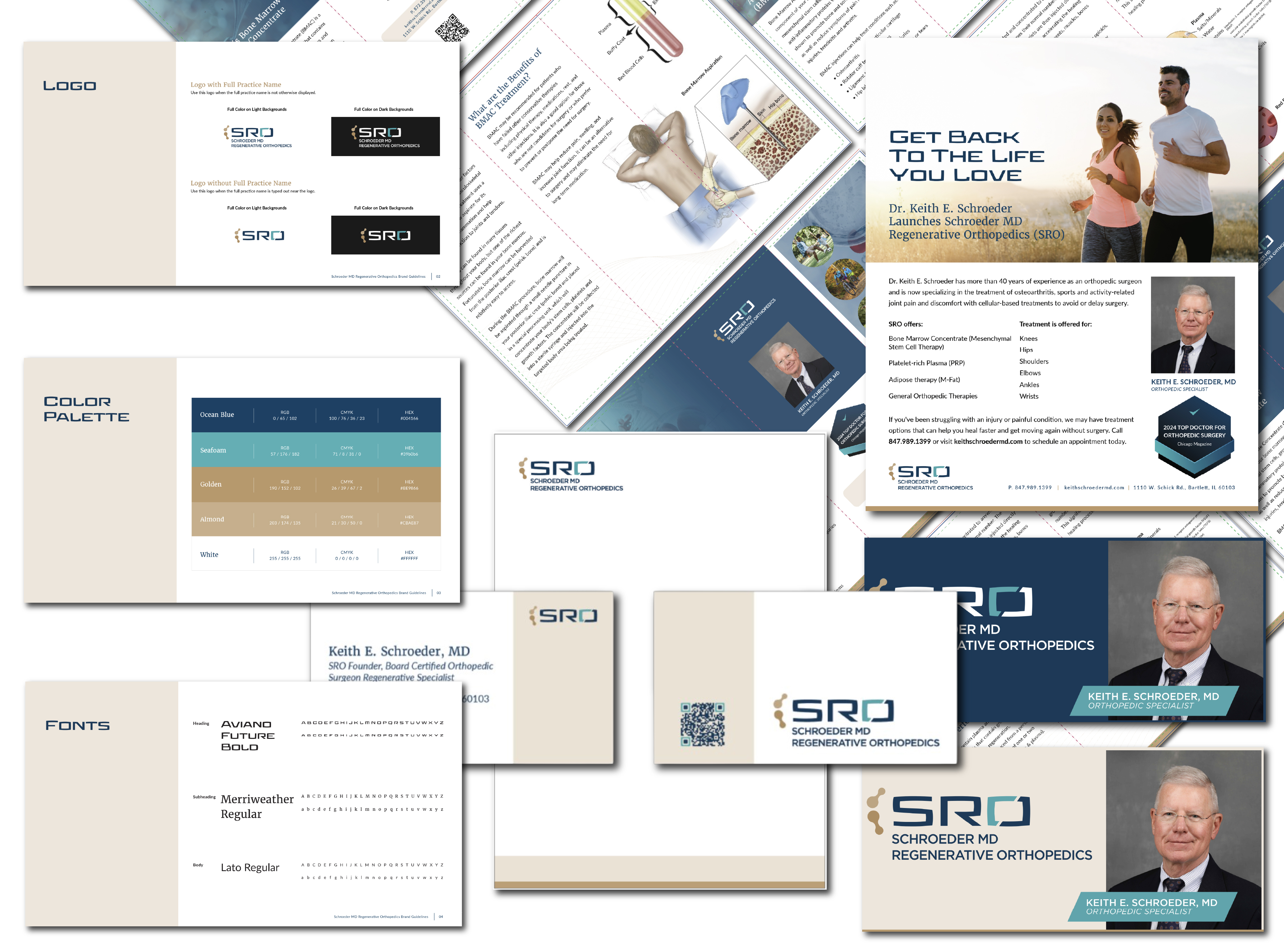
Schroeder MD Regenerative Orthopedics (SRO) specializes in innovative, non-surgical treatments for joint pain, arthritis, and sports-related injuries. Led by Keith E. Schroeder, MD, a highly experienced orthopedic surgeon and regenerative medicine specialist, the practice helps patients restore mobility, reduce discomfort, and return to the activities they enjoy through personalized regenerative therapies and advanced orthopedic care. SRO came to us with a strong business idea and wanted View’s help with branding and other marketing materials such as printed ads, brochures, email graphics, and stationery.
Logo Development
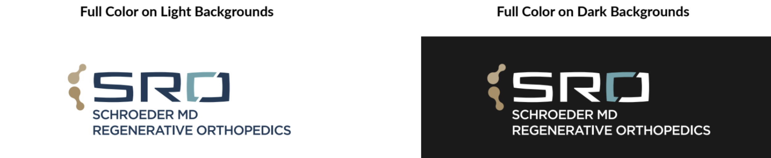
The logo was the first component of the branding build. It combines a small element inspired by bone joinery frames, while the SRO is represented with a simple yet bold and techy font that displays the practice’s commitment to modern patient care.
Mood Board Development
View began to set the tone of SRO’s branding design with the creation of mood boards to help identify visual directions SRO wanted to employ. View created and presented a few mood board versions based on the initial conversations, all highlighting various aesthetic directions. Once the team had chosen their favorite look and feel, we moved on to solidifying the overall brand image.
Brand Guidelines: The Foundation for Business Marketing Materials
When building the brand for this business, View wanted to find a healthy balance between welcoming and professional that mimicked the culture of SRO’s practice. The color palette of blues and tans feels mature and grounded, helping to enhance trust, and calls upon calming design elements, helping patients feel at ease during a painful time. The simple yet elevated fonts and imagery woven into the brand work together to make the business marketing materials easy to understand and less stressful when booking.
Printed Ads
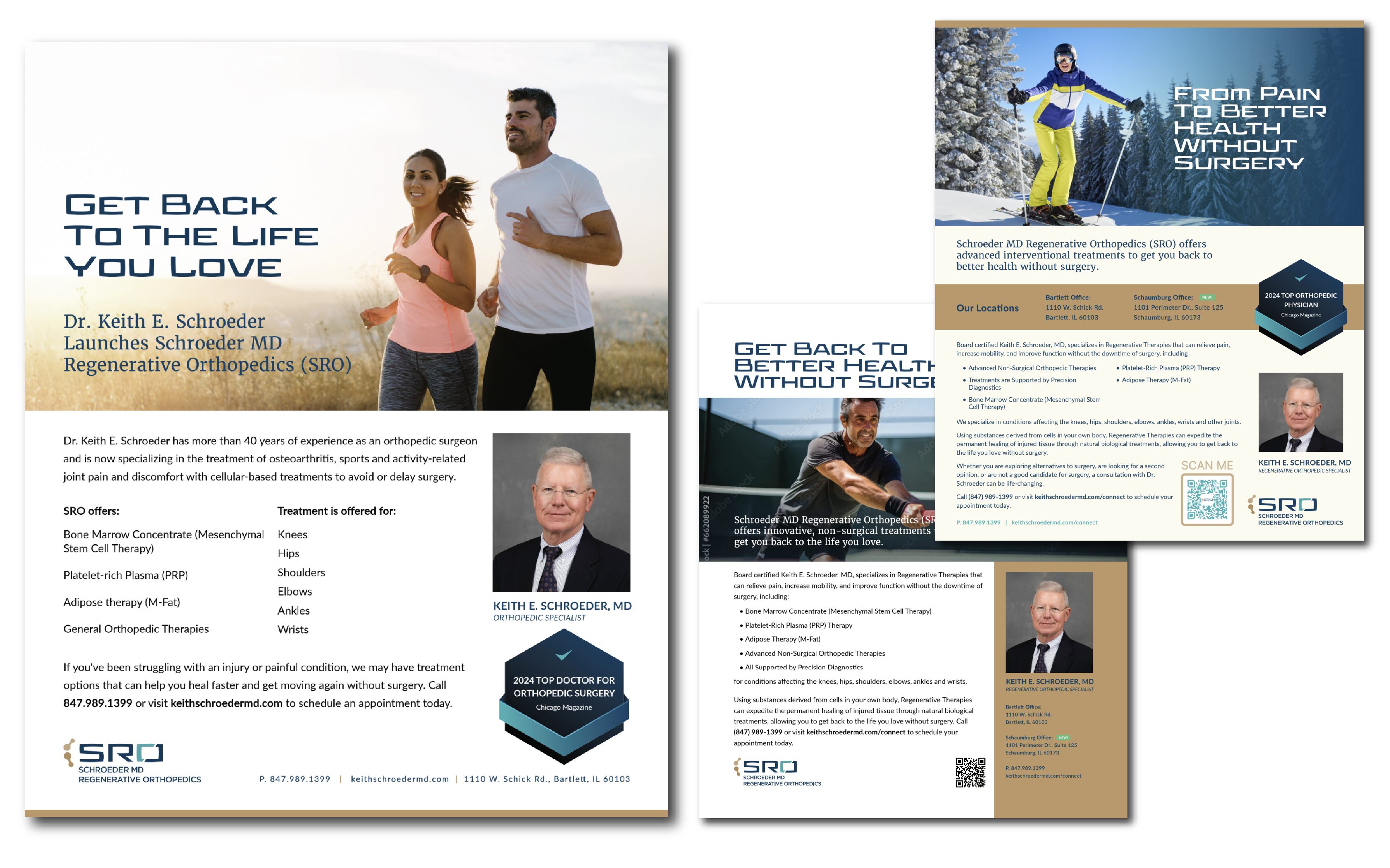
View made a variety of business marketing materials for SRO. One of the early materials created are print advertisements for the magazine Quintessential Barrington, helping showcase the practice and its advanced orthopedic care to a local, targeted audience. The ads were created to connect with the magazine’s affluent local readers while highlighting Dr. Schroeder’s decades of orthopedic experience and focus on proper patient care.
Brochures
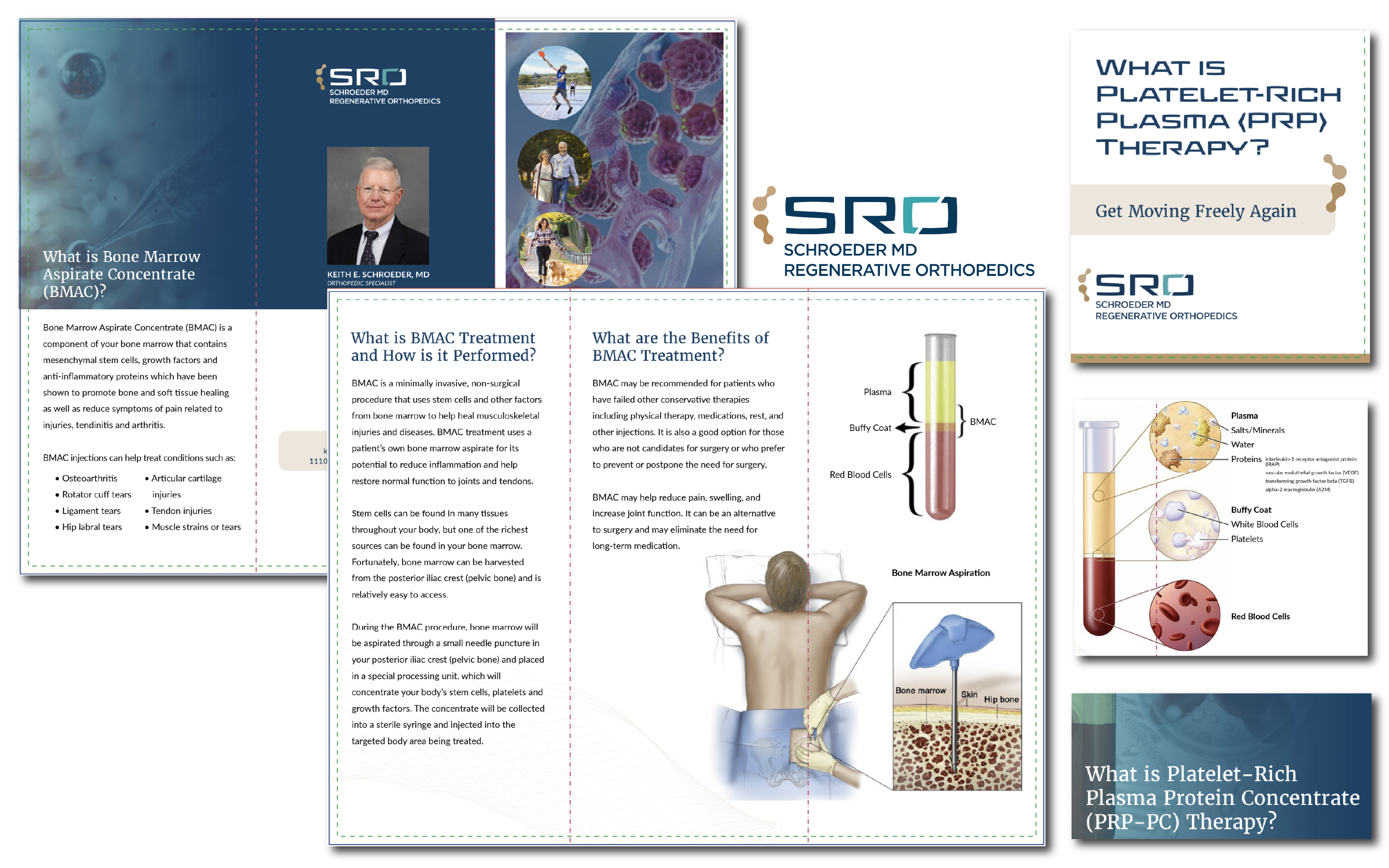
Using the brand guidelines we developed, View designed a series of three patient-focused brochures highlighting Platelet-Rich Plasma Protein Concentrate (PRP-PC), Platelet-Rich Plasma (PRP), and Bone Marrow Aspirate Concentrate (BMAC) treatments that patients may not be familiar with. Each brochure maintained SRO’s consistent visual identity while presenting the complex medical information in a more approachable format that helps educate patients about their treatment options and the potential benefits of the orthopedic care.
Email Graphics
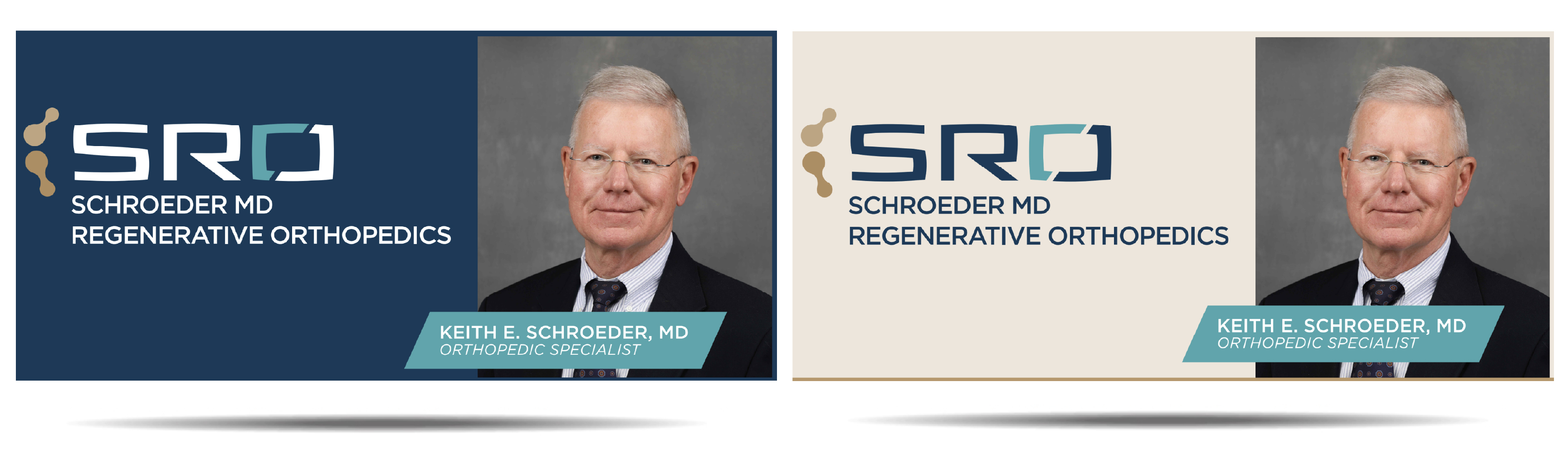
View also designed a few variations of a header graphic that the practice could use in their emails. The addition of these graphics to their emails helped create a consistent, professional look across the practice’s email communications.
Stationery
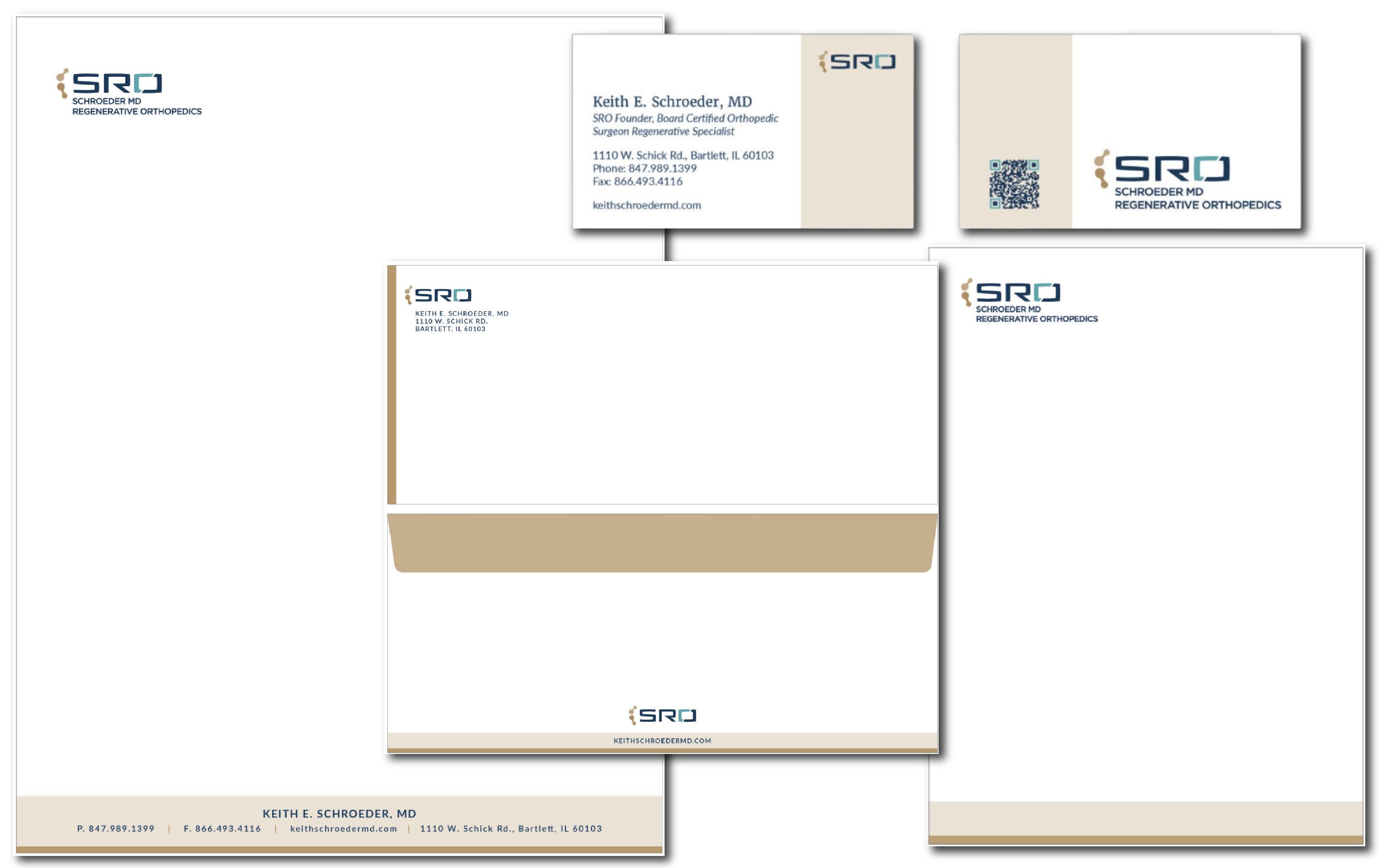
Finally, View designed a comprehensive set of business marketing materials, including business cards, envelopes, folders, letterhead, notepads, and posters. Each piece followed the established brand guidelines to create a cohesive and professional look across patient-facing materials, helping strengthen brand recognition and maintain consistency throughout the practice.