View’s Take on Pantone’s 2026 Color Trend Forecasts


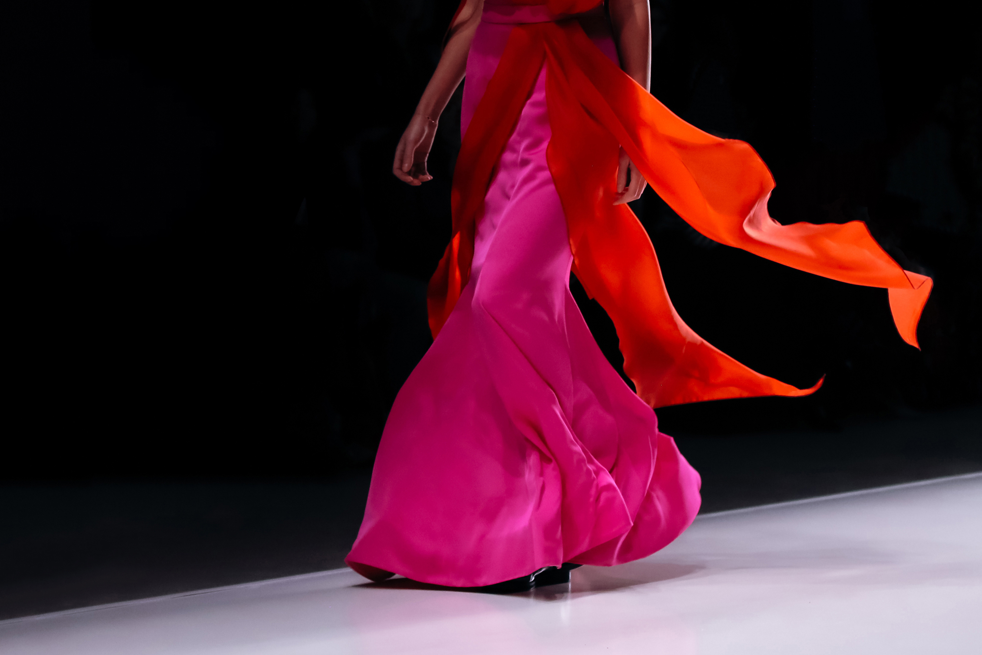
As the festivities of New York Fashion Week come to a close, magazines, designers, and creatives alike are looking towards the 2026 London Fashion Week (LFW). LFW is sure to present innovations and interesting new concepts using form, textures, patterns, and colors. Pantone, one of the global leaders in professional color standards and color trend forecasts, has chimed in with their predictions and insights into the standout colors of the Spring/Summer 2026 collections we’re gearing up to see.
.png)
The bright, ten-color palette reflects the spring and summer seasons, using a mix of vibrant, mood-boosting hues with a range of neutrals that give the palette balance. The executive director of the Pantone Color Institute describes it as a blend of familiarity and function with elevated pops and details that evoke emotion. When used in the designs seen in LFW, the palette mirrors the theme of “elevating the everyday”, exciting and accenting the traditional neutrals. Designs using this palette don’t scream for attention, but rather will effortlessly mix comfort with edge, the colors connecting and building off of each other to form a story and emotional reaction.
This trend palette and other color trend forecasts don’t just apply to what we wear, but also other forms of design like interior and graphic. Applying a neutral base as a wall color and implementing pops of color with the furniture, art, and decor can give a room that same “elevated everyday” feel, providing a traditional functional space with elements that excite the people inside. For graphic designers, color is also one of the most important elements of a design. This palette specifically is packed with cues for creating designs that feel both grounded and commercially relevant, as well as expressive and personally resonant with customers and viewers.
As you’re reading this, take a second to glance around our site. View’s color palette, which utilizes bright shades of purples and pinks with accents of both bright and muted oranges is the epitome of what Pantone’s color palette is getting across. We share the emotions that the mixture of colors provoke: authentic and reliable, yet still fun, expressive, and forward-thinking.
Pantone’s Spring/Summer 2026 palette goes beyond the fashion it was created from. It’s a creative toolkit for designers that’s infused with emotion, tradition, and a desire to subtly push ideas and creativity forward. Whether you’re creating the next fashion statement, a bold interior space, or a brand identity, this colour report reminds us that great design isn’t just something to look at, but should make us feel something. The colors of the Pantone palette evoke a nearly perfect balance of excitement and energy with calm, rooted tradition.

View’s Work for Schroeder Communications and Pilot Properties Recognized in the 32nd Annual Communicator Awards
View Marketing & Creative honored with two Awards of Distinction at the 32nd Annual Communicator Awards for excellence in B2B and Real Estate digital strategy.

Branding that Stuck Out at CES 2026: Elements to Consider for Future Tradeshow Booth Ideas
Make a plan with our team


