
Event Branding for one of Chicago’s Leading Architecture and Design Professional Member Associations
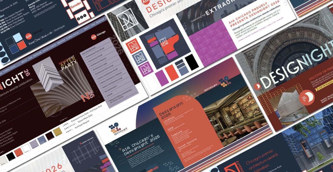

AIA Chicago is the local chapter of the American Institute of Architects, serving as a leading professional organization for architects and design professionals throughout the Chicago region. Founded to support excellence in architecture, urban design, and the built environment, AIA Chicago provides advocacy, education, networking opportunities, and industry resources for its members. The organization plays a vital role in shaping conversations around design, sustainability, equity, and civic engagement while promoting the value of architecture. Through events, professional development programs, awards, and community initiatives, AIA Chicago fosters collaboration among architects, industry partners, and civic leaders to advance the quality and impact of the built environment across the city and beyond.
One of AIA Chicago’s most prominent annual events is Designight, the chapter’s premier architectural awards ceremony and celebration. Bringing together architects, designers, industry leaders, students, and members of the public, Designight showcases the outstanding achievements of AIA Chicago members and recognizes excellence across a broad spectrum of architectural developments. The event honors projects and individuals through a range of prestigious awards celebrating innovation, sustainability, social impact, and design excellence. Designight consists of the initial awards ceremony, followed by a rooftop after party.
Designight, which has been a staple event for many years, comes with a unique challenge; the event stays the same, but the branding does not, requiring a new brand identity each year. This year, AIA Chicago came to View in search of event branding for Designight 2026, which is set to take place this autumn.
AIA Chicago’s Asks for Designight Event Branding
AIA Chicago was looking for event branding that represented architecture, including using grids, and simpler, sleek architectural design elements. AIA also has their own branded “AIA red” color and “Architype” font, which had to integrate seamlessly with the brand design. The elements they were in search of included a logo, color palette, and pattern elements that could be used across promotional materials, award presentation slides, light projections, and more. The View team took their feedback and created five unique moodboards for the AIA Designight team to choose from, each with their own sources of inspiration and storytelling fit for the night of celebration.
View’s Moodboards for Designight
Our team presented AIA with 5 moodboard concepts initially. These were meant to gauge what the AIA Chicago team was looking for so we could further narrow down the designs and nail the branding on the head. Our moodboards served as a way for them to visualize their event branding in context of the variations we created.
Round 1 - The Initial Moodboards
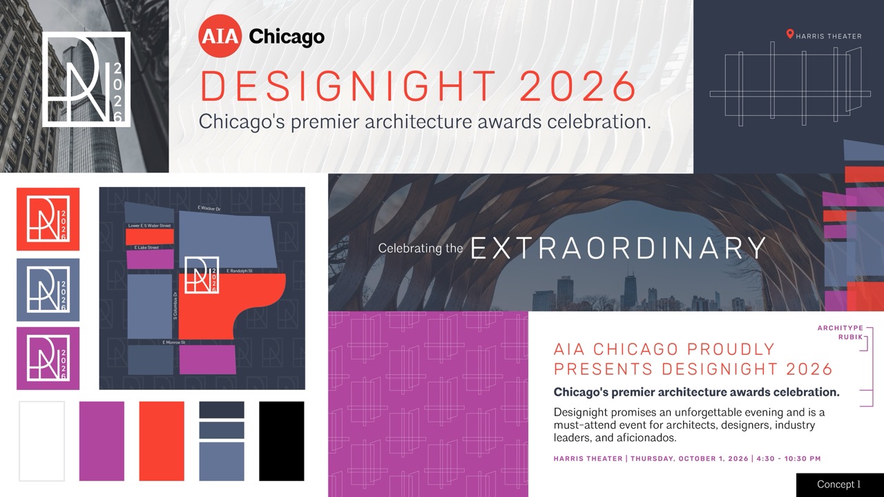
- Concept 1: The inspiration for this moodboard was developed from a color palette pulled from AIA’s core branding, one designed to pair well with both a celebratory daytime event and a sleek after party. The visual elements were designed to nod to the event’s location without being too literal; with textural layers pulled from Chicago architecture and abstract design elements that point to the event’s iconic location, the Harris Theater. Rubik, a bold yet friendly header font pairs with AIA’s Architype font, used both in regular and bold weights. The geometric logo was designed to adapt well to light, dark, or textured backgrounds.
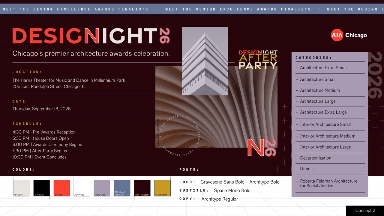
- Concept 2: This moodboard concept is rooted in the idea of layering, drawing from the way architecture itself is developed through sketches, structural systems, and evolving perspectives. This carries throughout the event identity with layered textures, architectural linework, perspective-based grids, color fields, and typography that feel both graphic and constructed. The color palette builds on established AIA colors while weaving in a dusty lilac and rich mahogany to create a rich visual language that will translate well to the event’s lighting environment. This system is designed to feel immersive and architectural while celebrating finished buildings as well as the process, structure, and storytelling behind design itself.
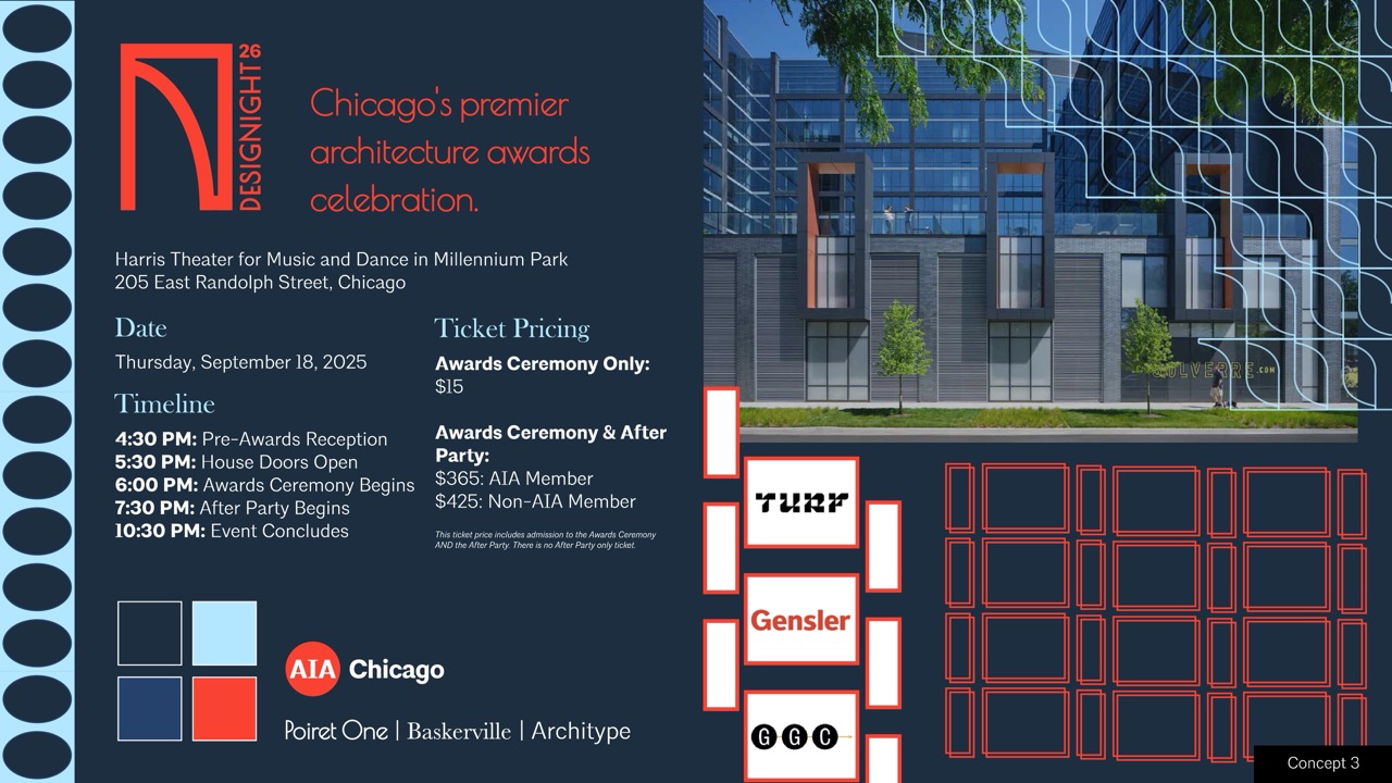
- Concept 3: This moodboard was inspired by the Chicago School architecture style that stemmed from the late 1800s, capturing the essence of Chicago’s deep-rooted history through its distinct architecture, while honoring AIA red paired with the colors of the Chicago flag. The graphic elements are inspired by literal architectural details of Chicago School buildings, including bold molded cornices which can be seen in the pale blue layered pattern, Chicago-style tripartite windows, which can be seen in the red pattern and sponsor showcase, as well as arches and egg molding. The logo is bold yet sleek and architectural, abstractly showing the “D” and “N” of Designight, while also subtly displaying the cornice motif. The elements are constructed on a grid, however can be manipulated on projections to create motion and visual interest.
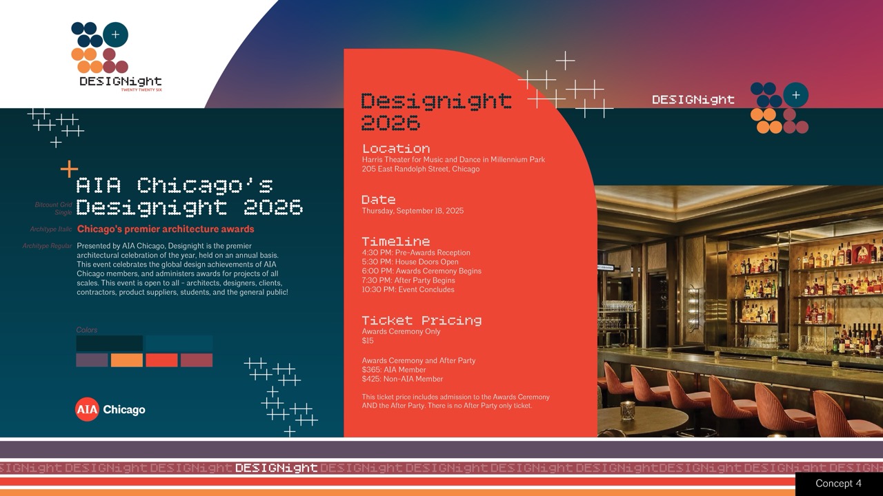
- Concept 4: This concept was inspired by the sunset as a nod to the Designight evening. Center marks are arranged on a grid in a sporadic pattern to evoke twinkling stars, while AIA red is paired with additional sunset-inspired hues throughout the design. Circular elements and rounded corners reference the moon and the soft shapes of a sunset, with circles also forming the “2026” typography. The Bitcount Grid Single font further reinforces the rounded aesthetic and pairs seamlessly with AIA Chicago’s Architype font.
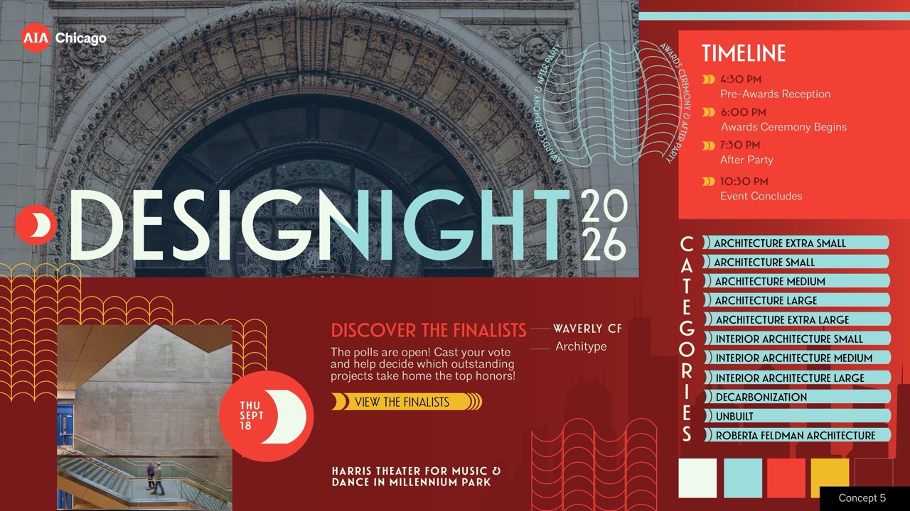
- Concept 5: This concept bridges the organic heritage of Chicago’s historic architecture with modern, high-contrast digital elements engineered for a dynamic evening atmosphere. The moodboard features elements that echo the CTA routes, transit grids, and architectural blueprints that the city is known for. These elements are also a nod to Chicago's very own Marina Towers. A rich, deep burgundy canvas establishes visual comfort for the darkened theater, while striking cyan accents and the signature AIA Red create an energetic, dual-tone aesthetic that lends itself to a seamless transition from a prestigious ceremony to a vibrant afterparty.
Round 2 - The Event Branding in Action
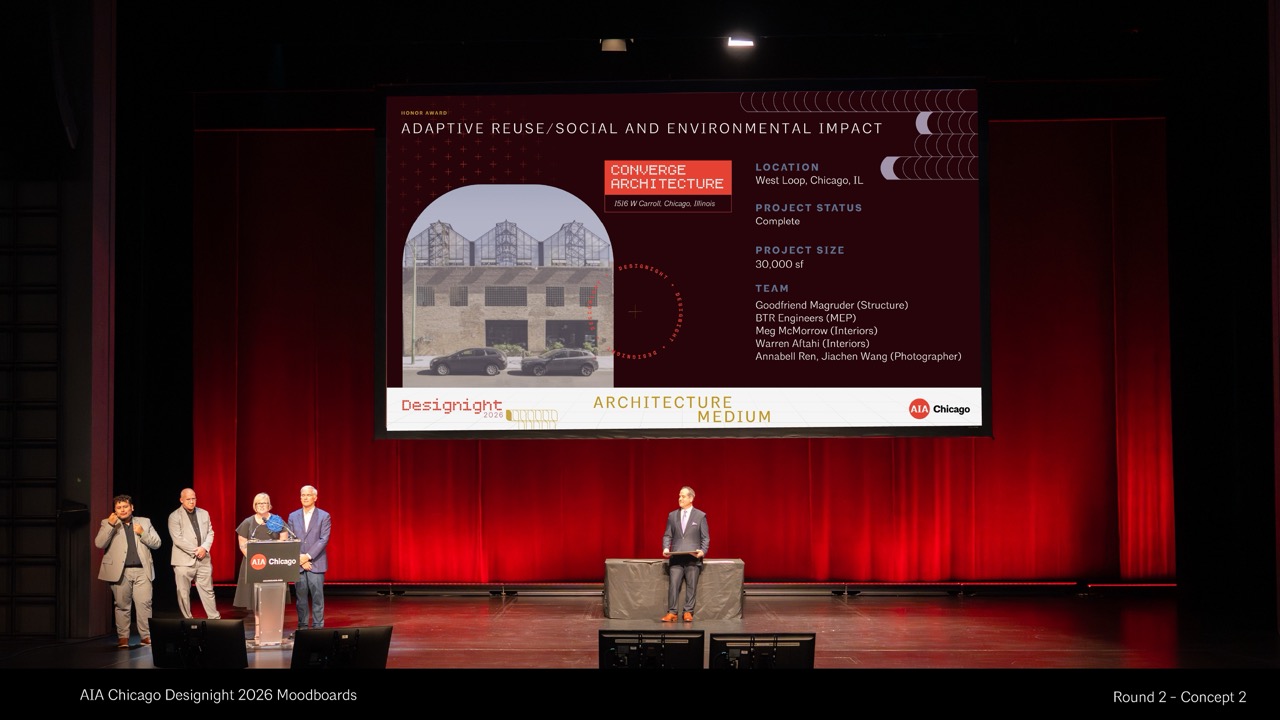
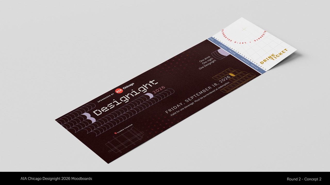
After seeing our initial moodboards, AIA Chicago decided they wanted to narrow it down to two options. They liked the use of patterns throughout our boards and wanted to see how these patterns would play together into a design suite. We took their notes and edited the two selected designs to integrate elements from other boards into updated branding. We also mocked up what both of these brand concepts would look like in the context of Designight by bundling the branding together with a presentation slide and drink ticket.
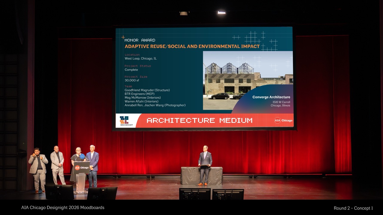
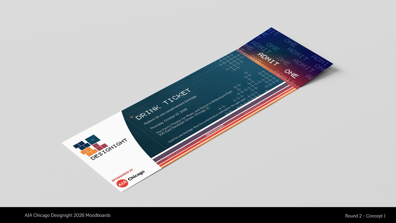
For the first concept, we took our original design, inspired by the gradient sunset over Designight, and incorporated more structured, geometric patterns to mirror the precision of architectural layout. The main event logo enforces this sense of digital discipline through the calculated use of an 8-bit, pixelated display font, which pairs seamlessly with deconstructed lines and crosshair center marks that nod to technical design software.The sunset-inspired color fields and structural patterns interact to mimic a network of twinkling city stars and transit grids, offering a highly modern, tech-forward aesthetic that honors Chicago design.
Our second concept was initially rooted in the literal process of drafting. This direction expands on the idea of layering-drawing from sketches, structural line grids, and shifting perspectives to build a rich visual language. Taking the colorways from our previous designs, we built on this foundation to incorporate more sophisticated architectural patterns and visual interest designed to keep the viewer's eye moving dynamically throughout the layout. The closer you look, the more of the design narrative you experience. This system frames the event's identity like a constructed building, celebrating both the finished form and the layered storytelling behind the design itself.
The Reveal — Designight 2026 Event Branding
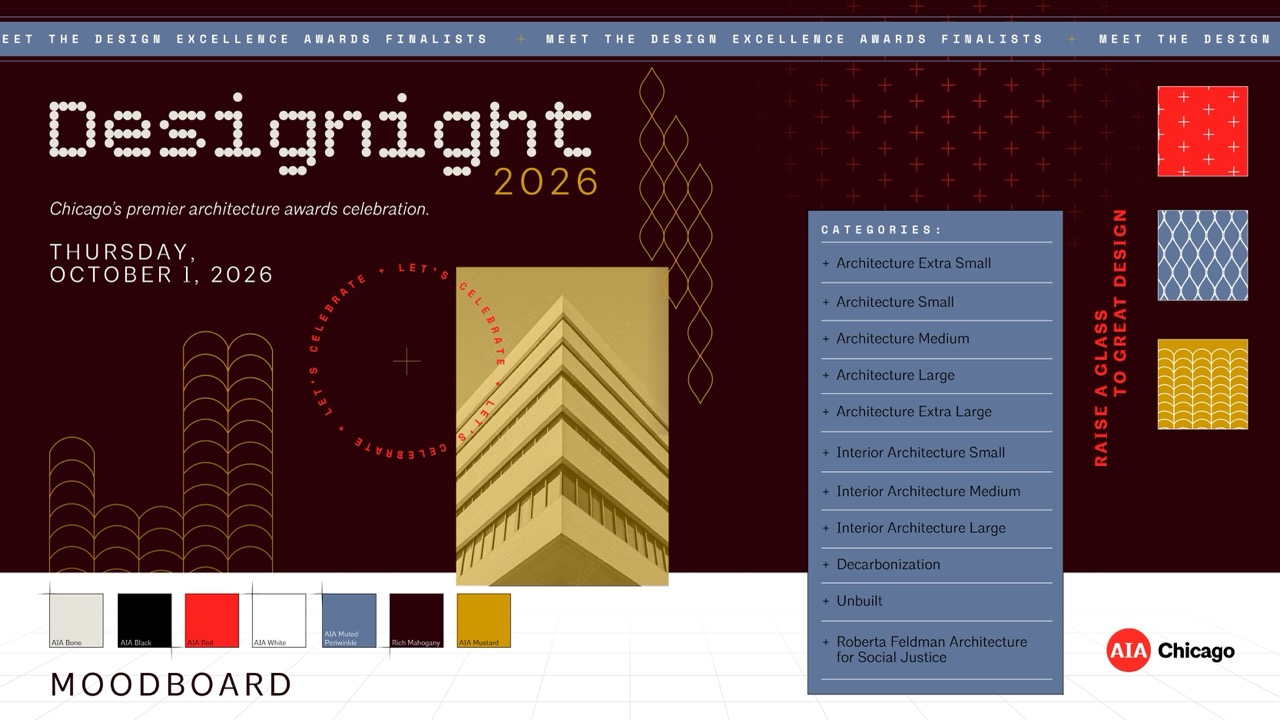
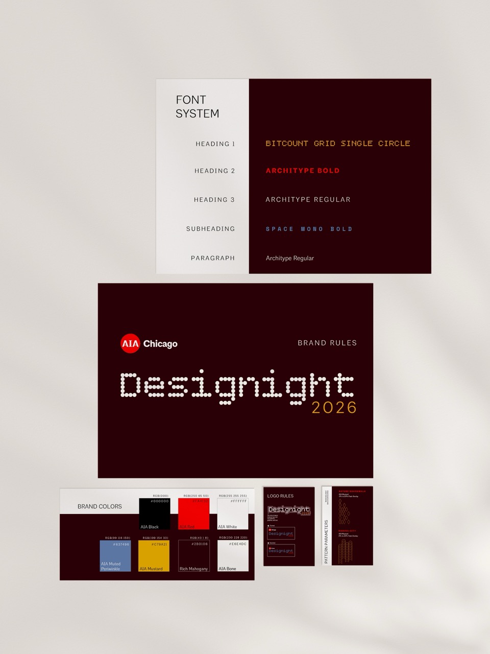
Our final design stemmed from what was originally Concept 2 with integrated patterns from a number of the concepts, which transformed into a visual event identity that pays homage to our wonderful city with the right amount of professionalism and whimsy that the night called for. What resulted was an elegant yet playful design that tied in patterns stemming from the iconic Marina City Towers and the Nature Boardwalk. We also incorporated elements from a secondary asset suite, including a perspective faded grid, a circular radial plus grid, and an architectural radial emblem. By removing the dusty lilac from our initial exploration, we arrived at a high-contrast evening palette grounded in rich mahogany, mustard, periwinkle, and the mandatory AIA Red. This refined system perfectly balanced technical precision with a celebratory night-out atmosphere, allowing the patterns to fluidly interact with typography while honoring the structural mastery of Chicago design.
The Deliverables
To bring Designight 2026 to life, we developed a comprehensive suite of digital and print assets, optimizing each to balance high-energy visuals with clean readability:
- Presentation Slides: Designed with a rigid, editorial layout utilizing clean square photography and high-contrast text blocks to streamline project and award announcements.
- Print Materials & Tickets: Developed custom event drink tickets and physical materials that layered the structural linework over rich mahogany canvases for a premium tactile experience.
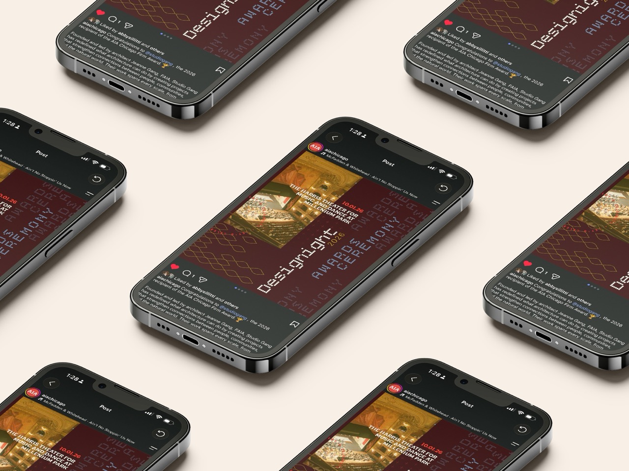
- Social Media Templates: Created a flexible kit of social graphics that utilized text-wrapping rules around the patterns to dynamically feature event highlights, "Save the Date" launches, and award announcements.
The Brand Guidelines
To ensure the identity remained flawless, we defined strict brand parameters governing the rules of the visual assets. These guidelines set parameters for pattern scales and alignment, spatial discipline, a universal pattern gradient, and asset-specific constraints.
Looking Forward to Designight
Ultimately, our collaboration with AIA Chicago for Designight 2026 proved that technical precision and celebration can exist beautifully in the same space. By transforming the literal framework of architectural drafting into a living, dynamic event identity, we provided the chapter with a visual system that feels uniquely rooted in Chicago's design history while looking firmly toward its future. As the industry gathers this autumn at the Harris Theater, the resulting brand experience will not only guide the evening's prestigious ceremony and afterparty but will also serve as a striking testament to the very structural mastery, storytelling, and innovation it was built to celebrate.
ChatGPT Ads News: Understanding How ChatGPT Advertising Works
Commercial Interior Design Trends We Saw at NeoCon 2026
Make a plan with our team


